You are using an out of date browser. It may not display this or other websites correctly.
You should upgrade or use an alternative browser.
You should upgrade or use an alternative browser.
List growth/shrink reporting
- Thread starter nadworks
- Start date
twisted1919
Administrator
Staff memberWe'll have to ask @ghimes since he's the one that implemented the feature and he is currently taking a few days off, so when he's back, he'll tackle this.Can I speed this up somehow?
nadworks
Active Member
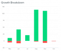
Would it be a total pain in the neck to present the graphs for list growth (new subscribers vs. unsubscribes) more like this?

It would make more sense and present a more accessible snapshot. The current graph combining positive (subscribers) with negative (unsubscribed) in the same section above the X-axis, is a little awkward.
When I drill down to the 1-month level, it just shows 2 bar charts (one for last and one for this month). There's no further details / drill down, so basically providing the same info as the 1-year or 6-months charts.
The 1-week option shows the 1-month charts.
Also, it is always displaying the total unsubscribed, not the gains/losses per period (i.e. month / date range)? To show a trend, there should be a graph showing all new subscribes in the given time period vs. all new unsubscribes. Fine if that would need to be a separate graph.
Sorry, I know this is nerdy stuff, but it's the reporting we're being asked to do with the aim of seeing if a) our acquisition campaigns are working and b) if our content and email frequency are hitting the mark.
Also, the following numbers are TOTALS, not AVERAGES, right? At least in my case it's definitely totals.

Thanks. I know this is a lot of work.

It would make more sense and present a more accessible snapshot. The current graph combining positive (subscribers) with negative (unsubscribed) in the same section above the X-axis, is a little awkward.
When I drill down to the 1-month level, it just shows 2 bar charts (one for last and one for this month). There's no further details / drill down, so basically providing the same info as the 1-year or 6-months charts.
The 1-week option shows the 1-month charts.
Also, it is always displaying the total unsubscribed, not the gains/losses per period (i.e. month / date range)? To show a trend, there should be a graph showing all new subscribes in the given time period vs. all new unsubscribes. Fine if that would need to be a separate graph.
Sorry, I know this is nerdy stuff, but it's the reporting we're being asked to do with the aim of seeing if a) our acquisition campaigns are working and b) if our content and email frequency are hitting the mark.
Also, the following numbers are TOTALS, not AVERAGES, right? At least in my case it's definitely totals.

Thanks. I know this is a lot of work.
Last edited:
twisted1919
Administrator
Staff memberI think we can do this considering the unsubscribed, blacklisted, unconfirmed as negative value on that graph and change the stacking.The current graph combining positive (subscribers) with negative (unsubscribed) in the same section above the X-axis, is a little awkward.
That's a little more complicated to calculate, but doable.Also, it is always displaying the total unsubscribed, not the gains/losses per period (i.e. month / date range)? To show a trend, there should be a graph showing all new subscribes in the given time period vs. all new unsubscribes. Fine if that would need to be a separate graph.
Those are averages in fact. They are calculated by dividing the sum for all campaigns opens/clicks/etc that the list was used against, to the number of campaigns. So, averages....Also, the following numbers are TOTALS, not AVERAGES, right? At least in my case it's definitely totals.
Cosmin
nadworks
Active Member
Thanks. I was thrown by the three decimals and read all figures as "thousands".Those are averages in fact. They are calculated by dividing the sum for all campaigns opens/clicks/etc that the list was used against, to the number of campaigns. So, averages....
